FFGW Insights
Poster: The Birds
 Thursday, May 3, 2012 at 12:26AM
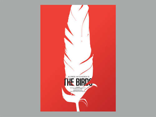
This poster of Hitchcock's The Birds was created as a collaboration between my husband, Corey Holms and Marian Bantjes as part of the Now Showing project. The posters are still availbale for sale for only £35, but will only be available for a short time more. Snatch one up now if you're interested!
Twitter Roundup: Apr 30
 Monday, April 30, 2012 at 8:54AM
Busy time here at FormFire Glassworks - in the home stretch for getting my Fab order out the door. In the meantime, here's some great stuff I found through my perusal of Twitter links:
Images:
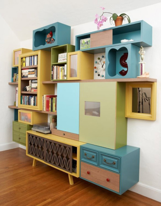
Donkey Cabinet: great colors and composition by Thomas Wold at Anthology Magazine blog - Via @justinablakeney
Storefront: post by Chloé Douglas on Rena Tom - Via @plentyofcolour
Chive and Cheddar Buttermilk Scones: need to make these for my husband - Via @tasteologieFEED
Nomu Tea Set: Love the combination of ceramic and cork. Classy yet down-to-earth - Via @bltd
1939 New York World's Fair poster: from Pantone's Color History of the 20th century - Via @brainpicker
Hobbies: the Personal Path to Creativity - Via @CreativityPost
How to: Use a single paper towel to dry your hands - Via @brain picker
Jamie Oliver's Food Revolution Day: May 19th, stand up for real food! - Via @richardbranson
Pinterest Picks: Apr 20
 Friday, April 20, 2012 at 8:26AM
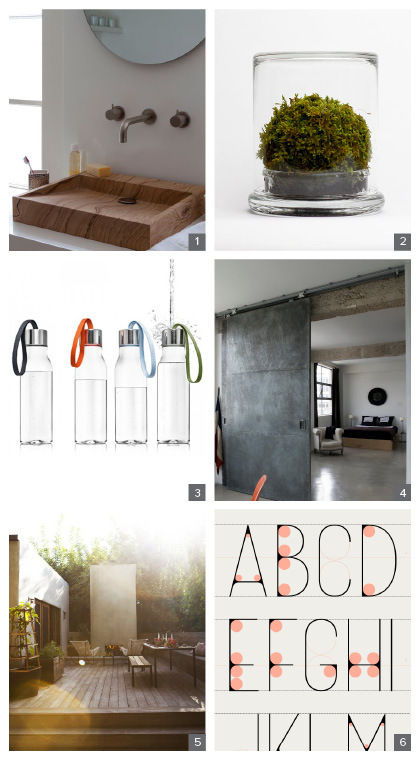
It's been a crazy month, with a short vacation and me getting pieces ready to ship for Fab, and although I haven't been blogging much, I have been pinning! Here is a selection of some great stuff I found on Pinterest recently:
1. Carved stone basin: With grain and color that makes it look like wood, this is easy maintenance. I originally thought I was a marine grade wood piece, but either way, the shape is super.
2. Moss terrarium by themosserstore: If you've followed my blog here, you know I have a thing for terrariums. This one is a minimalist version that requires only a small amount of care. Great look for an end table, in a bookshelf, or in a grouping on the dining table.
3. Water bottle by Eva Solo: This bottle is made from BPA-free plastic (I prefer glass,) but the shape and the great loop handle in different colors makes this a winner.
4. Industrial barn door by Ochre: Combined with the polished concrete floors and clean modern furniture, this space looks pulled together and spare yet still very livable.
5. Amy Neunsinger photography for House Beautiful: I love everything about this. The photo itself is stunning with the light streaming in, the outdoor space is inviting with multiple seating areas, and the overall vibe is relaxing.
6. Sky High branding for Radisson Blu Hotel: I like the proportions and attenuated look of this type. Of course I was drawn to the image showing how the letterforms were constructed.
If you'd like to see more of my over 12,000 (really!) pins, feel free to follow me on Pinterest.
PnS Post: Artwork
 Thursday, April 19, 2012 at 8:28AM