To give a kick-start to the re-launch of my website and blog, I decided to re-run one of my favorite blog posts. I hope you enjoy it as much as I do.
As I had a conversation yesterday with a couple of my husband’s friends that work in the realm of graphic design and web development, a discussion ensued about the nature of design and the idea of basic design as a cross-disciplinary ability. I found out that one of them had a metalsmithing and jewelry background about which I had not previously known. I related a story told to me by Brad Pearson about a professor of his requiring that for a final grade in a glassblowing class, the students each (separately) bring in the glasswork piece that they believed was the most successful of the year. The professor then proceeded to cover the piece completely with black spray paint (this is glass, remember, it will come off). He then asked the student to look at it again to see if it was still their favorite piece. The point of this was to illustrate that before all the color and decoration that the basic form and idea needed to be a solid and well-realized one.


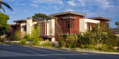
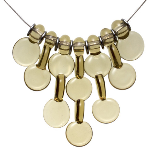
Both of the objects in these images deal with color and texture, albeit on a radically different scale. My interlaced droplet set incorporates the rhythm of the interlocking forms as well as a change in texture between the flat discs and the edges of the perpendicular discs. The 7 separate beads are designed to interlock with one another to create a whole that goes far beyond what a view of one of the beads might suggest. The parts are tied together with the repetition of the spacer discs. The house employs rhythm in the layout of the window and door system, and the continuation of the pattern into the metal siding and sheet metal fascia. The change in texture and color between the stucco, metal, glass and the wood allows each part to become an important piece of the whole composition, while the play of openness against solid structure allows for a hierarchy of form. The volumes interlock in a deliberate way, relying on each other to create an overall composition. Although one requires a knowledge of structure and includes the need to create spaces amenable to living, these are merely added parameters that are built upon the basic design foundation. Knowing how to put together a building that doesn’t fall down and has the spaces required by the program does not make one a good designer. Nor does being able to melt glass onto a mandrel, the basic requirement that separates lampworking from other artistic expression.
I am a sucker for anything design-oriented. I watch the competitions on Bravo - Top Design, Project Runway, Shear Genius, and think that I could probably work in those occupations as well. I put together fun Halloween costumes for my kids with pretty great zombie makeup complete with open wounds and maggots. I often work with my husband when he comes upon a stumbling block in a new typeface he is designing. I’m happy to say that my children are developing an eye for good design and proportion as well feeling confident about trying new creative endeavors.
I have recently been looking at adding metalsmithing to my glasswork, creating fully handmade jewelry items. As I look into the new requirements and constraints of metalwork, I continue to remind myself that design is design is design.
 Thursday, June 14, 2012 at 8:05AM