With all the hoopla about Twitter and heavy requirements being placed on 3rd-party Twitter apps, you've probably heard tell about a new paid networking service called App.net, which is growing each day, both in the number of users, but also in the amount and quality of the conversation within its posts. I was lucky to be one of the early adopters who got in prior to funding (find me at @formfireglass,) and have made a point of being active there, both with new acquaintances, and helping out people who are new to the service.
One of the main issues I have heard from some of those early adopters who are not really active on the service yet is the lack of iOS apps available. There is currently one client available for Android, Hoopla, and one that has made it through the Apple App Store, Rhino. I have been beta testing three other clients, and have to say that I'm seriously impressed with the amount of work and detail that they have put into them in such a short amount of time (funding was backed August 11th.)
Most of these early apps are missing what many might think of as important pieces. Some lack conversation views, others don't yet have reposting capabilities, still others are working on fixing crash bugs. But much more important that what they lack is the wide range of ways these developers are trying to create their own special addition to the App.net community. Each one has parts that really stand out from the rest, that make their app noteworthy, and that make the App.net experience more pleasurable.
Xtendr (Now Rivr, updated 9/15/12) - dev: @tonymillion
I have been using Xtendr Rivr the longest of all the betas, and have seen it blossom under the watchful keyboard of Tony Million. Based out of the UK, he has not only been continually revising the app, but has been strongly connected to the beta testers, initially with troubleshooting bugs, but then keeping them apprised of possible changes in the UI and soliciting opinions.
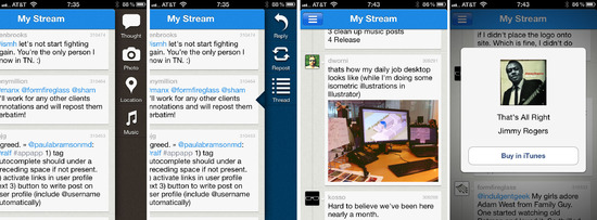
Xtendr Rivr has four great items that I think make it the most full-featured of all my betas:

Slide view drawers for actions at both sides of the main screen: The current stream of posts slides off to the left to allow access to either a compose drawer to start a new post, or a reply drawer to respond to an existing post. This behaves similarly to Mountain Lion's Notification Center, and it allows for action buttons that are a good size for the phone and easy to select. The left-side drawer includes navigation and settings, but currently sends most of the stream off the page.
Photo posting with inline viewing: Very quickly, the developers started to figure out ways to add images to their posts, and many connected to storage locations with links to a web page to view them. As soon as th App.net team added Annotations, Tony jumped in with a way to view the images inline. He is currently working on a new build which, I blieve, makes the images even larger. This prevents clicking out of the app, or having a new page pop up within the app. I love being able to see these without having to take an extra step on something I may or may not be interested in seeing.
Location posting: Xtendr is currently using Foursquare's large data set to tag user location. Currently, there is no direct check-in, but just the ability to call up previously entered Foursquare check-ins and add new locations. The current plan is to add some type of inline map via Annotations to add a visual to the text location. Maps now viewable inline – updated 9/15/12. (I don't care about actual check-ins, but do like to add location to my posts periodically.)
Music posting with inline listening: The most novel feature that Tony has put together is #appmusic. While listening to a song on my iPhone, I click the music icon in the Compose drawer, and it brings up an iTunes list of the current song. Clicking an entry inserts the cover art and song name at the top of your post. But even better than that, clicking on the artwork in a post pulls up a overlay screen that starts immediate playback of the iTunes song snippet, and gives a link to the iTunes store page. So many times on Twitter I've seen suggestions for songs, but couldn't be bothered to check them out. This makes it so very easy!
PostStream is one of my favorite apps in terms of use and looks. Created by Jared Manfredi, it is the most TweetBot-like of the apps I've tried. This app doesn't have the bells and whistles that Xtendr does, but is a simple Twitter-style app, done beautifully.

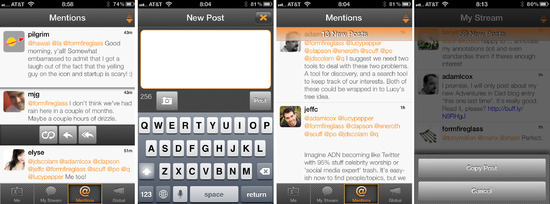
Gorgeous graphics: The PostStream graphics are grey, white and orange. The color combo is fresh without being boring, and the judicious use of texture keeps the UI from coming across as flat and unfriendly. Simple icons and clear links make this app easy to navigate. I like the use of a lighter weight typeface, although some feel it doesn't stand out quite enough. Post spacing is set one on top of the other, with a thin line to separate them, leaving a large amount of post real estate visible.
Pull-down compose window: Although I didn't find this right away, I really like the placement of the Compose window. You drag it down from the top bar, while at the same time, the keyboard comes up from the bottom, providing a nice, clean, empty place to write.
New post number: PostStream handles new posts exactly the way I want them to happen. A refresh adds new posts above those I am currently reading, and a counter of new posts is added to the top of the screen with a trasnparent orange bar. This goes away as I reach the top of my feed. I am often off my phone for periods of time, and find it frustrating to scroll down to find where I left off. This works perfectly for me. When I come back to the phone, this is the app I go to to catch up.
Copy post: Tap and hold on a post offers an option to copy the post. I originally went looking for ways to do this when most apps didn't support reposting, and was glad to find this as an option. You never know when you might want to pass information on to someone else.
AppApp had the most solid Twitter-like experience from the first build I tried. It is visually clean, with all the basics accounted for. Like Xtendr, it has Notification support, so it quickly became part of my App.net stable.

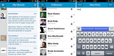
Follower list shows connection: Periodically, I check to see if I have new followers, to find out if they are people I want to follow back. I always switch to AppApp to check this, because the follower list includes an arrow notation that shows whether it is a one-way connection, or if I have already follwed them back. A quick tap into the user profile, and I can decide if I want to change the current relationship.
Autocomplete username: AppApp provides an inline autocomplete for the username that appears below the compose window. And it's a smart search, so you can find the name if you know just a little piece. ”It learns any you type in, any users you get a push notification from or any users in any of your user lists... (learns as you scroll)” - via @jtregunna. Works well, and rounds out the solid nature of the app.
As an aside, there are a few Mac apps and web apps worth checking out: Appeio – a web app with inline photos and video, thread following, and also sports a multiple stream view for seeing personal posts, mentions, stream and the global view all at once; moApp – a Mac client with mention counts and Notification support; and Appetizer – a Mac client with Notification support, post copying and favorites.
All in all the developer support and their willingness to explore options has been superb, and has made this initial App.net experience a great one.
 Thursday, November 8, 2012 at 8:00AM